New Brand Identity & Guidelines of the Product
During the period spanning from 2020 to 2023, the Neverinstall logo exhibited a strong suitability for an early stage company. However, as the brand evolved, certain issues emerged regarding - brand experience, image, positioning, valuation and audience. The logo's legibility encountered difficulties when scaled down to more compact dimensions, impairing its visual clarity. Our users shared valuable feedback regarding the Neverinstall logo, expressing that it appeared somewhat unusual and intricate, basis which we did the rebrand.
Introduction
Brand
Identity

Mood board
Simplicity First: We love simplicity. It makes our message clear and powerful.
Purposeful Blue: We chose a calming yet confident blue to give a balanced look.
Bold Identity: We want to be easily recognized and remembered.
Versatile Design: Our design fits anywhere, keeping our brand's essence consistent everywhere.

Keywords
Cloud
Product builders
Computing
Browser
Web Dev
app store
Native UX Experince
Future of tech
Transformation
Fast
Productivity
Brand Purpose
We defined our brand purpose as - To inspire harmonious innovation and empower accessible collaboration through our cloud platform that revolutionizes the way people interact with desktop applications. Our new logo concept,
‘Distorted Unity’ would perfectly encapsulate our brand’s forward-thinking and balanced approach.
Intuitive
Accessible
Logo
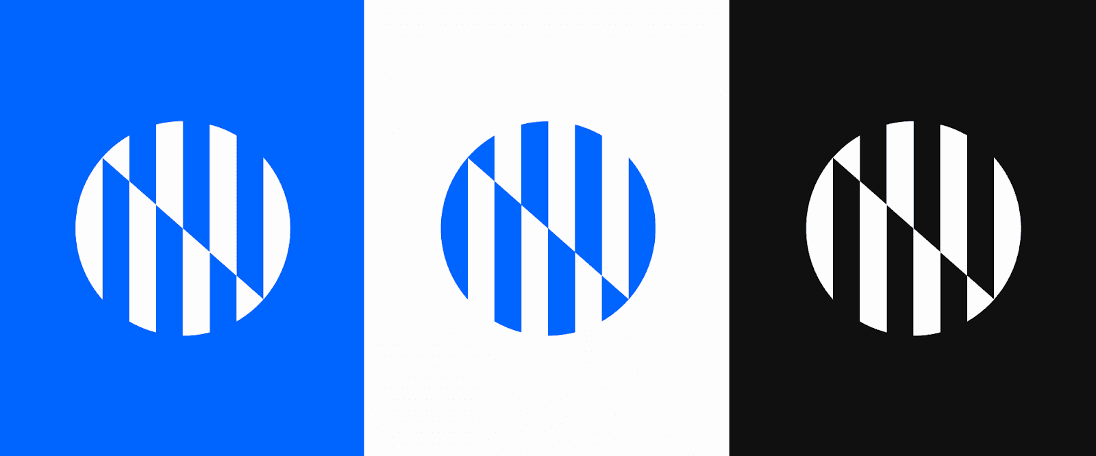
Concept: ‘Distorted Unity’ inspired by the concept of visual distortion and the power it holds, our logo showcases a striking representation of the letter “N.” Parallel lines, intersecting at a precise 40-degree angle, form a distorted yet captivating shape that highlights the letter. Symbolizing the fusion of Internet and Native elements, this design captures the essence of two distinct parts coming together as one unified whole, embodying our brand’s forward-thinking and harmonious approach

Logomark Variations
The logo mark is showcased in three unique and distinguishable color variations. Each variation offers a different color scheme that enhances the visual appeal and versatility of the logo, allowing it to adapt and resonate effectively across various backgrounds, platforms, and contexts.
Final Logo

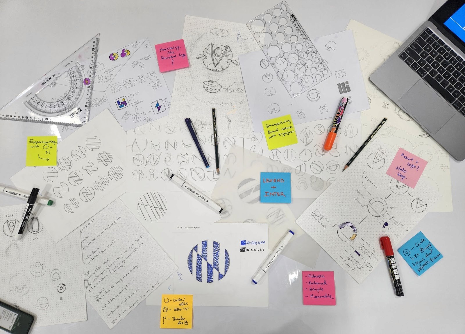
It all started with a clear goal: to reimagine the essence of the Neverinstall brand. To ignite our creative process, we plunged into a brainstorming exploration centered around the core identity of the brand.
Embarking on a voyage of creativity, we immersed ourselves in a brainstorming session, conjuring a diverse array of objects and concepts that truly capture the core of our brand. Our exploration spanned a spectrum of elements, including Browser, Globe, Circle, Wordmark, Bolt, Portal, and more.
Color Theory
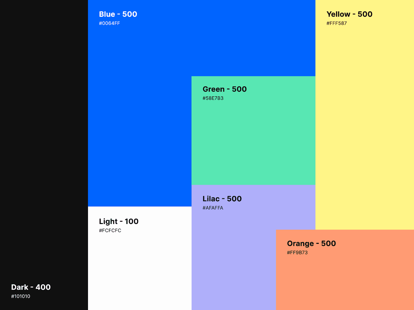
Color elicits an immediate, visceral response in the perciever. We created a color system that’s empathetic, calm, and confident - just like our brand. These colors add depth and dimension to our identity when used as a curated palette. They convey quality and focus.
Psychology
Primary colors
Blue: This shade signifies trust, security, and stability, reflecting our commitment to reliability and assurance. Just as a clear sky imparts confidence, this blue hue enhances our brand's credibility.
Black: The infusion of black conveys reliability, sophistication, and a wealth of experience. It mirrors our professional demeanor and extensive expertise, akin to a well-tailored suit symbolizing refined mastery.
White: White brings simplicity, calmness, and purity to our palette. It embodies our dedication to seamless interactions, like a fresh canvas ready for engagement, ensuring effortless user experiences.
Secondary colors
In addition to our main colors of blue, black, and white, we also have a set of secondary colors: green, lilac, yellow, and orange. These colors work together to support and enhance our main palette.
Green: It represents growth and balance, giving a fresh and lively feel.
Lilac: This color adds a calm and creative touch, inviting introspection.
Yellow: A cheerful and energetic hue, it brings positivity and brightness.
Orange: Warm and inviting, orange adds excitement and a touch of adventure.
All these colors come together to create a complete and appealing visual style that embodies our brand's values and character.
Typography
With the intention to reduce visual stress and improve reading performance, we chose Lexend & Inter. Their versatile nature allows them to appear sophisticated and modern, as well as inviting and friendly.

2
Team
Rajas Parte (Brand Designer)
Sharwari Jangle (Product Designer)
Ram Pasala (Co-Founder)
Vishal Verma (Product Designer)
Goal
We wanted to give our brand a makeover to ensure a consistent and unified design approach. Part of this makeover involved introducing a new logo that embodies modernity, reliability, and memorability. Our ultimate aim was to offer the users an exciting and unforgettable brand experience that would resonate with them deeply.
DESIGNING THE BRAND IDENTITY
Thank You