Application of the new brand identity: Re-branding the Product’s UX & Interface
Context: After the successful launch of VDI UX and witnessing continuous user growth on our platform, we decided to expand our services to include new business domains like Bring Your Own Cloud (BYOC) and B2B. This required thorough research into the content and information we wanted to showcase on our landing websites, focusing on how users perceive us as a provider of personal cloud computing solutions. During this time we also launched Windows OS, AI Copilot, and a new pricing model. Hence, there was a need for new UI with improved user experience.
Introduction
3
My Role
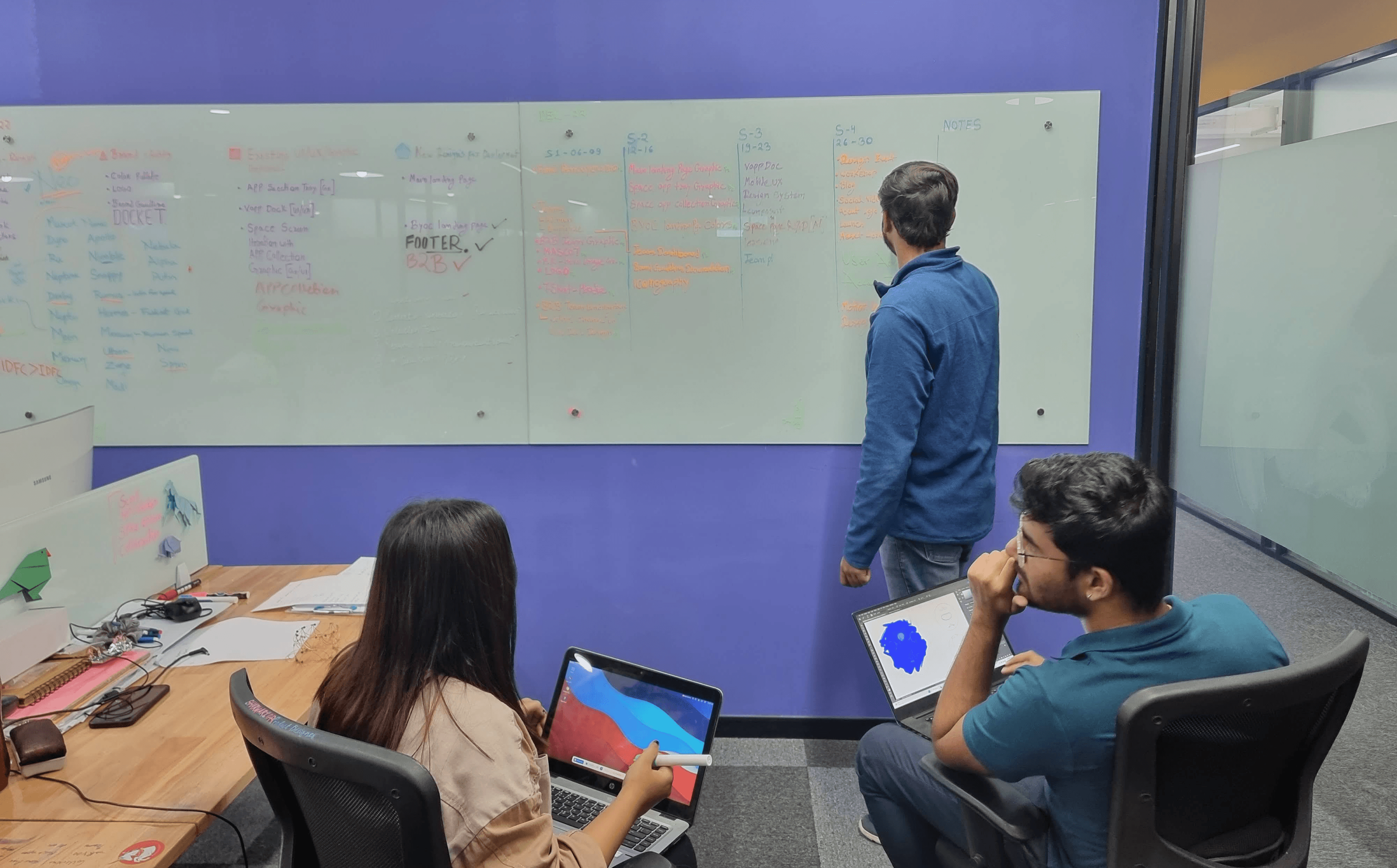
I worked closely with the Product Manager and with my two teammates, a front-end and 2 back-end developers.
We also closely collaborated with the users to define their challenges and requirements. Following the iterative design process,
We created several versions of high-fidelity wireframes.
Requirement
Bring consistency across all aspects of the user experience, Including all elements of our product's UI, all landing websites and usability of the product. Additionally integrate new features and such as dark theme based on user research, enhancing both functionality and visual appeal.
Solution
Redesigned the entire UI according to the new brand guidelines.
INTRODCTION
Design
Framework
Define
Scope of work
Key Insights
Site Map
2
Design
Make various iterations
3
Develop
Develop the finalized iteration into a usable Product
Testing
4
Discover
Competitor Analysis
Primary Research
Brainstorming
Affinity Mapping of Ideas
1
PRIMARY RESEARCH
DEFINE
DEFINE THE NEW USER FLOW
Understanding
User Needs
We conducted competitor research
We analyzed user interactions on the existing platform using heat maps, recorded videos.
We looked at how users engage with products such as Xbox, PlayStation, and Windows OS to gain further insights.
Insights &
Conclusion
Since our target audience was the developer community,
- our platform should have a dark theme.
As we were adding new features like AI and Cloud link
- put this out in the multi app page for discoverability.
As we found out that lots of our target users wanted to use Windows OS - give users the option to choose their OS before launching VDI.
We got the insight that our users were not scrolling the full website
- engage them enough to do so through videos, illustrations and good storytelling about the product and features.
Our research helped us define the following Scope of Work for the Product:
New User
Flow
Plans
Teams
About
Help center
Bring your own cloud
AI
Main landing page
Muti app
Launch
Login
Transitory
Vapp Dock
Header CTAs
Select apps and region
Sign up for free
Clustering
The Insights
Multi App
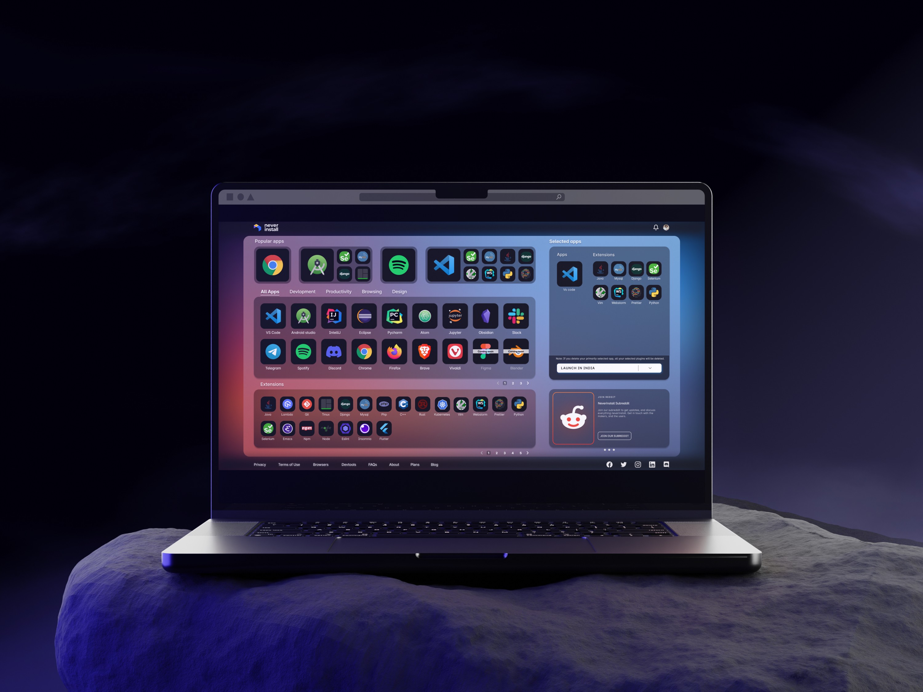
We're tasked with designing a single-page layout that seamlessly accommodates five sections: AI, CloudLink, Apps, Selection Tray, and Space Page. Our goal is to ensure that the layout fits on every user's screen size without the need for scrolling, providing a native desktop experience.
Transitory Page
Providing this for a much faster VDI experience. and show our new features so user will get to know and use the features and need to redirect user to transitory page and give them option to resume the space.
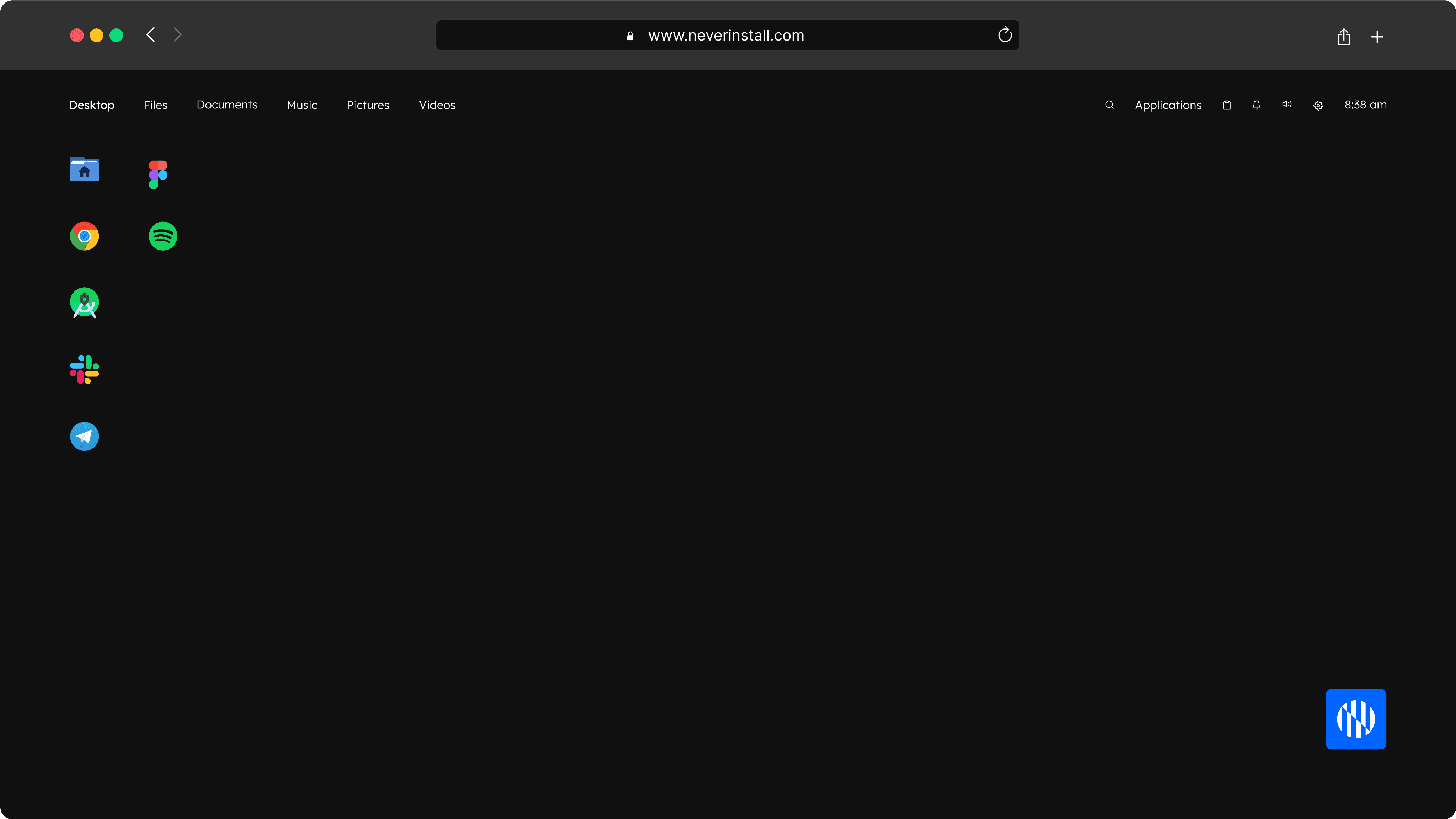
New Dock
We have to redesign the dock because we have new AI features to offer.
Landing Websites
We need to give the information in a story format - that will help the user to understand the product and at the same time they can get to know about our offering and new features.
DESIGNING THE PRODUCT
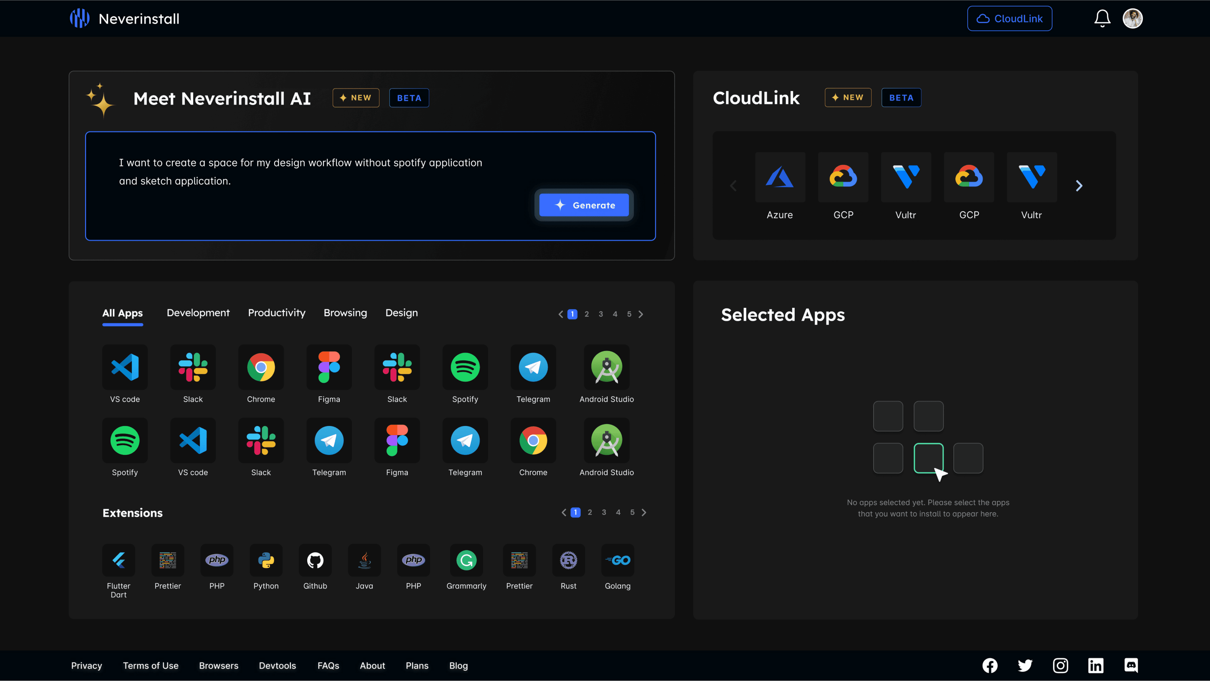
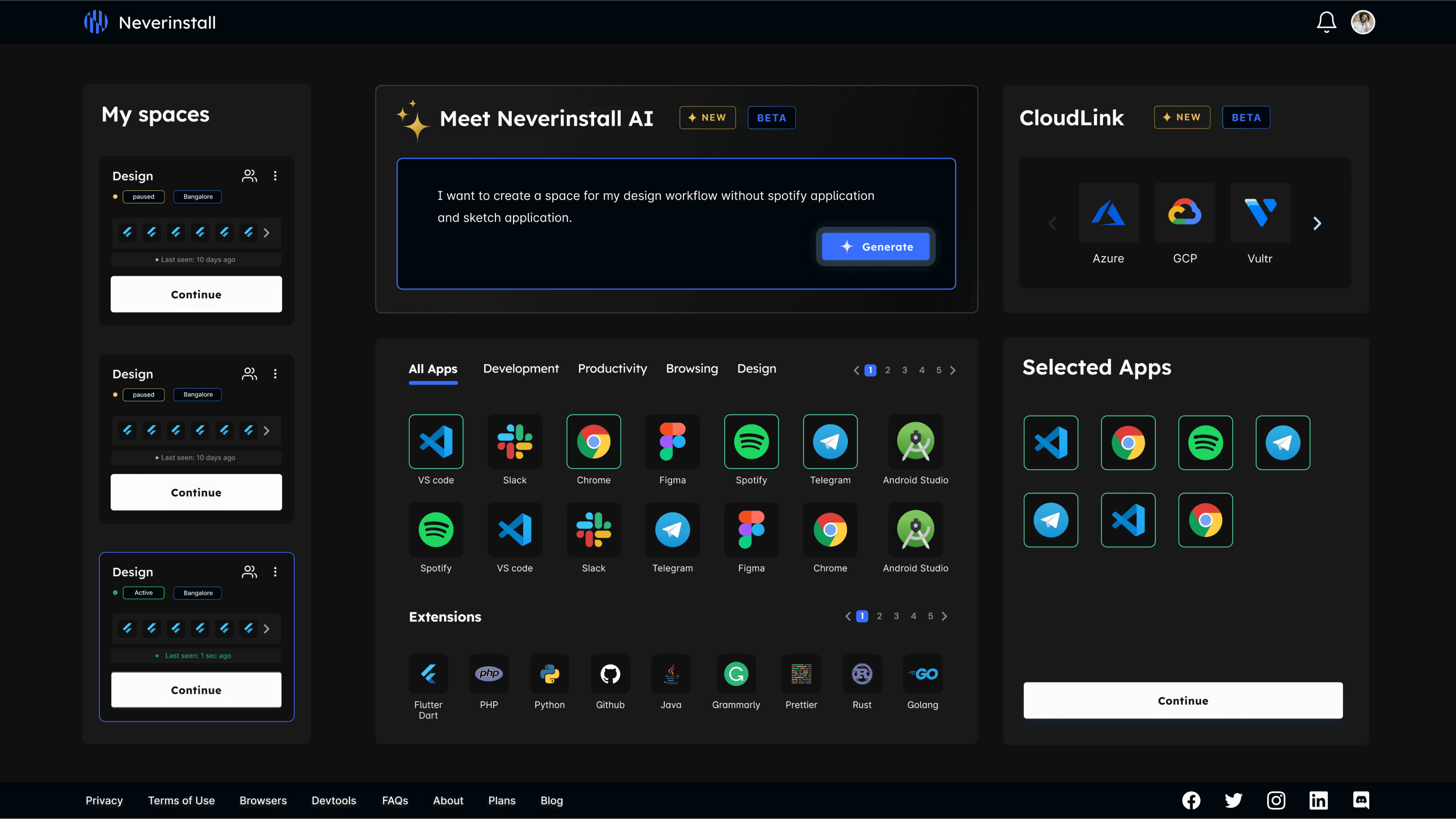
In our revamped multi-app platform, we introduced two features: AI and Cloudlink. The AI section lets users explore and add apps, operating systems, and select regions for VDI. Cloudlink integrates with five major cloud services, allowing users to easily use their own cloud resources.
We simplified the apps and extensions section by reducing icons and moved "My Spaces" to the multi-app page, enabling easy management of spaces. The selection tray helps users choose their operating system and region, redirecting them to a transitional page for further actions.

With the aim to enhance the user experience, we provided clear progress indicators for each stage of VDI creation. Users were now redirected to the transitory page on clicking the 'Pause app' button from the dock where they would now get two options to either delete or resume , ensuring a faster VDI experience. Additionally, we branded our new features to educate users about them while they wait, improving engagement during the process.
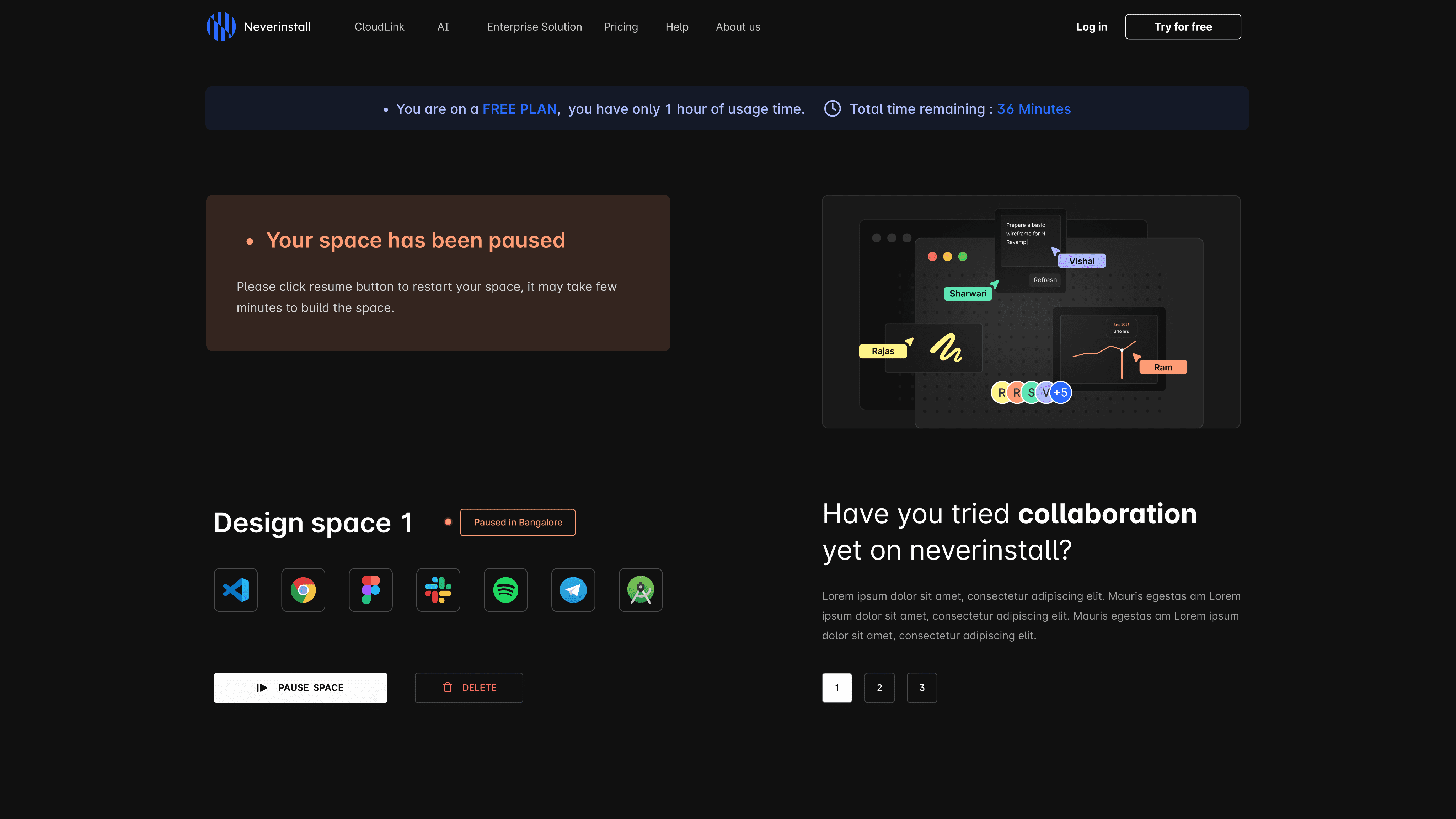

The updated dock now incorporates new AI features for completing tasks quickly, along with additional functionalities such as changing regions, collaborating, and toggling microphone and camera settings. Users also have the option to hide the dock for more screen space, providing greater control and easy access to primary controls.

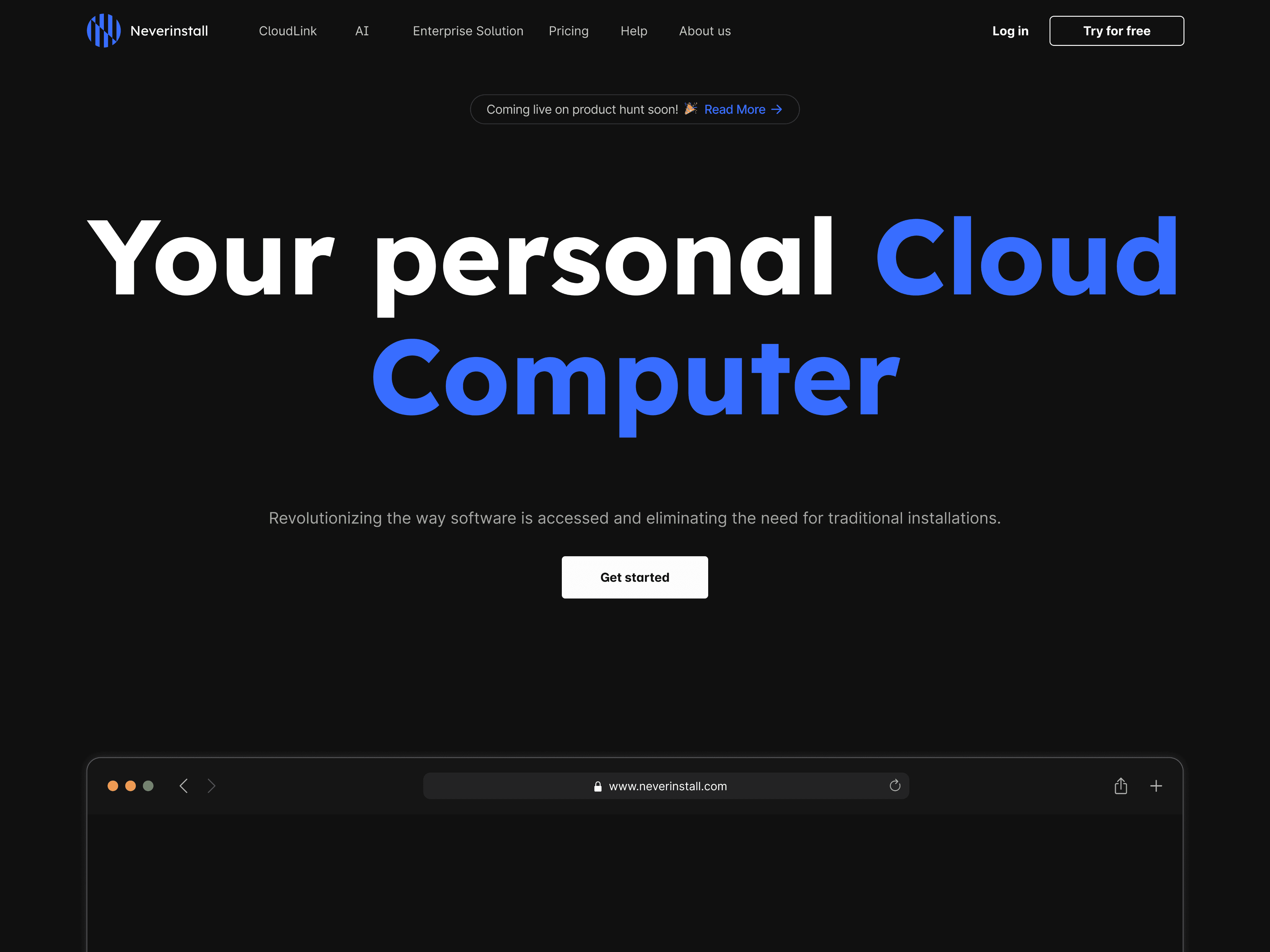
To address users not scrolling through the website, we engaged them with captivating videos, illustrations, and compelling storytelling about our product and features. For our developer audience, we opted for a Dark theme redesign.
In the hero section, we used large fonts for a bold company statement and showcased key features like our AI copilot through engaging videos. We highlighted team collaboration, Windows OS compatibility, and server capabilities in interactive sections. To add credibility, we included testimonials from satisfied users.
See the live website here
Multi App
Interface Design
Transitory Page
Design
AI Dock
Design
Landing
Website Design
Thank You